Do you remember the movie Pleasantville?
It’s that 1998 coming-of-age comedy drama film where two teenagers find themselves trapped in a 1950s TV show. Their entire existence is switched into black-and-white as they are sucked into this classic sitcom world. However, color is slowly reintroduced to this saturated world as the narrative develops.
At first it’s only a few paintings and flowers here and there, and it freaks the people out. Yet as more and more of the characters experience color for the first time, they eventually begin to understand and in fact seek out experiences which expose them to more of this new, saturated world.
Pleasantville can be a great analogy for how we in the film and video world choose (or sometimes don’t choose) to use color in our own films and projects. And, if you’ve yet to do a deep dive into color theory and really explore what different color schemes are and how palettes work, you’ve probably been living your editing life without seeing its true potential.
How does color theory in film work?
Before we go over some basic definitions and guidelines, let’s backtrack…quite a bit. In the very first days of film and cinema, there was no color. With a few experimental exceptions, color didn’t really make its way into film (and eventually television) until around the 1960s. Which means almost half of our film history was limited to black and white.
This means that, in the grand scheme of things, color is still a relatively new invention which filmmakers and content creators are free to experiment with as they like. That being said, color theory in film owes a great deal to color theory in general, which is where our definitions start.
Color theory is the overarching understanding of how colors work (and mix) with each other and how these colors can be used artistically to create emotion, moods, and even characters. And specifically in film, this is how we usually think of film color theory — simply as another tool for filmmakers to tell more emotional and impactful stories.
Using color palettes and color schemes
The real question in regards to how to use color theory in film and video actually comes down to understanding some of the different tools and devices artists have applied to color. Some notable examples would include color palettes and color schemes as ways to interpret, use, and experiment with color in your artistic film projects.
But what do these terms mean for a modern filmmaker?
Used somewhat interchangeably, color palettes and color schemes mean pretty much the same thing. They represent how artists choose to use colors in relation to each other, and as a way to categorize and associate connected colors together.
Take a look at the video essay above which breaks down how filmmaker Wes Anderson uses colors in his films. There’s not a frame, character, or item in Anderson’s cinematic world that hasn’t been carefully chosen or colored to fit within one of his various color palettes or schemes. The end result is a film which feels rich, emotionful, and clear in its messaging.
Understanding the color wheel and the triadic color scheme
Moving further away from film and deeper into color combinations as a concept, let’s look at some more of the basic tools and schemes artists use for working with color in general.
As you’ll notice in the video above, everyone from painters to home decorators have used color schemes to inform everything there is about how color is used and how it makes us feel.
There are some great tools developed over the centuries which can help us visualize how different complementary colors and analogous color scheme examples work together. The color wheel itself is a hallmark of understanding film color theory (and eventually how we use color in film).
From there, the color wheel can be used for more advanced techniques like using the triadic color scheme. And if you haven’t heard of this triadic approach before, it’s basically just a color scheme which uses a triangle to connect three different colors in a way that is very pleasing to our human eyes.
This process can be great for introducing complementary colors as a way to make warm and cool colors. It can also establish associative color palettes filmmakers can use for other complementary color schemes.
For example, if you’re using the primary color red in a project, the triadic color scheme means you’ll also want to consider utilizing yellow and blue as they’re on the opposite ends of the color triangle. (You could even try out some discordant color schemes or a monochromatic color palette to experiment with different color hues.)
If you’d like to read up more on how to use the color wheel and the triadic color scheme as a way to make a balanced movie color palette, I’d highly recommend these art- and design-focused blogs below:
- The Best Ways to Use Triadic Colors in Design
- The Only Color Combinations Cheat Sheet You’ll Ever Need
- Triadic Color Scheme: What Is It And How Is It Used?
How to use color in your films and video projects
Now, we can finally circle things back to our favorite colorless-to-colorful film Pleasantville.
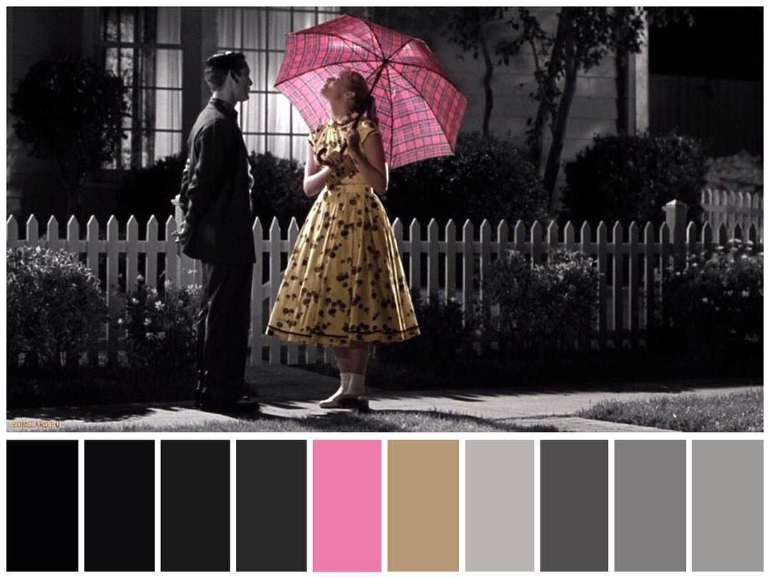
Look at the image above. The filmmakers are working off very particular (and quite unique) monochromatic color schemes and film color palettes as part of their overall color scheme, even in the scenes in which color is still being reintroduced.
It’s also a great example of just how much impact a movie color palette can make in a project. The differences between the dark black and the lighter grays really doesn’t give the viewer much emotional information. However, with the yellow dress and pink umbrella we’re starting to learn quite a bit about this one character and what she is feeling and represents in the film.
And this is really how you should be using analogous color schemes in your own projects. Starting as early as the writing process, if you can start to plan out what complementary colors might correspond with different characters, motives, and themes, then you can begin to build out triadic color schemes using analogous colors like the color wheel and the triadic color theory.
From there, the process is really as simple as adding a film color palette back into a black-and-white world. It’s a direct path for you to truly experiment and have fun with the emotions that you’re giving your characters and scenes.
Further reading
Hopefully these definitions, examples, and resources have given you a better understanding into the basics of color in film and how it can be used in your video projects.
If you’d like to learn more — or even delve into other interesting filmmaking topics like theory, cinematography, or editing — check out these other great articles from the Soundstripe blog:

